More interesting toy datasets: easter eggs
If you work with data, you’ve probably heard about them. Toy datasets are commonly used in examples for several data/ml-related libraries. Why so? Well, there are some nice characteristics that all of them share that make them good for this purpose: they are publicly available, so you can easily download it from anywhere with internet connection; they are generally not huge, so you can load all of it into memory; they are mostly clean datasets with well documented columns, which is something you don’t see very often in real life.
The name “toy” may imply that it will be fun to play with it, but that’s not the case for most of them. If you ever had the experience of actually playing with it, you know it ain’t fun!
Let’s start with the famous Titanic dataset. Where is the fun of taking data from a shipwreck event that killed more than a half of its passengers so you can build a model that will tell us the probability of survival of each individual? I mean, this dataset is relevant and all the analyses coming out of it bring up important social-economical issues. Still, it’s just not fun to do it!
Getting to another example, but a controversial one: the Boston Housing dataset. I’ve just recently found out that this dataset is actually racist. One of the features available in this dataset is supposed to reflect the proportion of black residents with respect to the total population in the neighborhood. I don’t think I need to go any further to conclude that there’s no fun in racist datasets.
And finally, as a biologist, I cannot forget to mention the Iris dataset! Measures of cepal and petal length? I guess if you are a botanist from the 1930’s, it would probably be fun to play with this dataset. If that’s not the case for you, you’d probably be less bored if you actually went the closest garden to see some flowers with your own eyes.
Let’s get to the point here. What would make a toy dataset actually fun to play with? I know, this is probably very personal. Personally, I love riddles and puzzles. I’ve played Myst, Portal, Cube Escape, Amnesia, etc and really enjoyed them! I also love some unexpected surprises — or, what we shall call here easter eggs. With that in mind, I started to think on how to bring this same experience to generate an actual fun-to-play toy dataset.
Hiding easter eggs in a dataset
Now we are going to explore different ways — with different levels of fun — in which we can hide easter eggs in our dataset. The easter egg can take endless forms, but let’s start with some kind of pattern. Something people can actually see if they manipulate and visualize the data in the right way!
Easy but boring: \( view(X)\)
The easiest and most obvious thing to do would be to draw the pattern in two dimensions, extract its coordinates and let it manifest itself in a scatter plot (i.e. \(view\)). To make it not immediatly obvious, instead of just giving the two dimensions, we can add some “noise” in form of additional random columns.
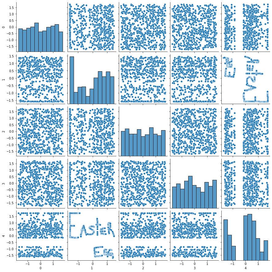
But that’s too easy! Anyone would find out in a matter of minutes after start looking at this data. Here is roughly how this is done ![]()
import pandas as pd
import numpy as np

def generate_dataset_with_easter_egg(
    easter_egg_columns: str, n_cols: int, n_rows: int
):
    # generate some dummy dataset that will be used to hide
    # the important columns
    dummy = pd.DataFrame([
        np.random.random(size=n_rows)
        for i in range(n_cols)
    ]).transpose()

    # concat dummy columns with easter egg
    full = pd.concat([dummy, easter_egg_columns], axis=1)

    # normalize all columns so we end up in the same scale
    full = (full - full.mean()) / full.std()

    # change the order of the columns randomly
    full_permuted = full.iloc[:, np.random.permutation(full.shape[1])]

    # just rename all the columns in order
    full_permuted.columns = range(full_permuted.shape[1])
    return full_permuted
Here, easter_egg_columns is the two-column dataset that stores the coordinates of our message. To generate this dataset with the message, I used the python package drawdata, that has a nice Jupyter widget for drawing scatters. If you’re lazy, here is a link for an online version that does not require any installation.
Let’s make it a little harder: \(view(f(X))\)
To make it a little more challenging, let’s add some more steps! Instead of having the pattern manifesting itself directly, what if we make the pattern appear after some kind of transformation? That way, the user would first have to apply this transformation in order to reveal the secret.
With that in mind, how do we pick a transformation? There is a trade-off between complexity and fun. If we pick some unusual transformation or even to many composed transformations, we might decrease too much the chances of the user actually finding the easter egg, which we want to avoid — can’t find easter egg == no fun. For this first experiment I picked one transformation that is not immediately obvious but rather common: PCA. Looking back at the title of this section, this means that we are just replacing our transformation \(f\) with \(PCA\). In other words, we want our two-dimensional pattern \(Y \in \mathbb{R}^{m \times 2} \) to be close enough to the two first principal components of the data \(X\), which will call \(P\) for brevity.
\[ P_{m \times 2} = \begin{bmatrix} PC_{1}(X)_{m\times1} & , & PC_{2}(X)_{m\times1} \end{bmatrix}\]
\[Y \approx P \]
So, how do we actually find the \(X\) matrix? If we think about our \(X\) matrix as a set of parameters that we can tweak and think about \(PCA\) as a generic transformation, what we are really trying to do here is finding the optimal parameters for which the result of the transformation gets closer to some target \(Y\). Does it sound familiar to you? We’ve basically described a general supervised learning setting!
Knowing that PCA is a differentiable transformation and that we can express the similarity between \(P\) and \(Y\) in terms of a loss function — root mean squared error, for instance — we now have met the conditions to use any gradient-based optimization framework and solve this as an optimization problem. Here, I’m picking Pytorch, but you could use whatever you prefer!
First, let’s see our PCAGenerator model. This is the container which stores the parameters and actually apply the PCA for us.
class PCAGenerator(torch.nn.Module):

    def __init__(self, dims):
        super().__init__()
        self.matrix = torch.nn.Parameter(torch.rand(dims).float())

    def forward(self):
        U, S, V = torch.pca_lowrank(self.matrix, q=None, center=True, niter=2)
        projected = torch.matmul(self.matrix, V[:, :2])
        return (projected - projected.mean(axis=0)) / projected.std(axis=0)
Simple, right? The important bits are:
- the
matrixattribute: this is the \(X\) matrix we mentioned before - the
forwardmethod: this is essentially performing the PCA and returning the first two principal components
Now, for the model training part. ![]()
def generate_dataset(
    target,
    n_columns,
    optim_kwargs=None,
    epochs=5000
):
    optim_kwargs = optim_kwargs or {
        "lr": 0.001,
        "eps": 1e-5
    }
    samples = len(target)
    target = torch.from_numpy(target).float()
    target = (target - target.mean(axis=0)) / target.std(axis=0)
    model = PCAGenerator((samples, n_columns))
    optimizer = torch.optim.Adam(model.parameters(), **optim_kwargs)
    loss_fn = torch.nn.MSELoss()
    losses = []
    min_loss = 10000
    for i in range(epochs):
        if min_loss <= 0.02:
            break
        optimizer.zero_grad()
        projected = model()
        loss = torch.sqrt(loss_fn(projected, target))
        losses.append(loss.item())
        loss.backward()
        optimizer.step()
        min_loss = loss.item() if loss.item() < min_loss else min_loss
    return model.matrix.detach().numpy(), projected.detach().numpy(), losses
Nothing too fancy going on here as well. We are basically minizing the RMSE between our projected \(P\) and our target \(Y\). You see, here we don’t care about model validation or generalization. We are purposefully overfitting the model for our pattern!
The results are interesting! We generated a dataset with 10 columns. Let’s see what it looks like.
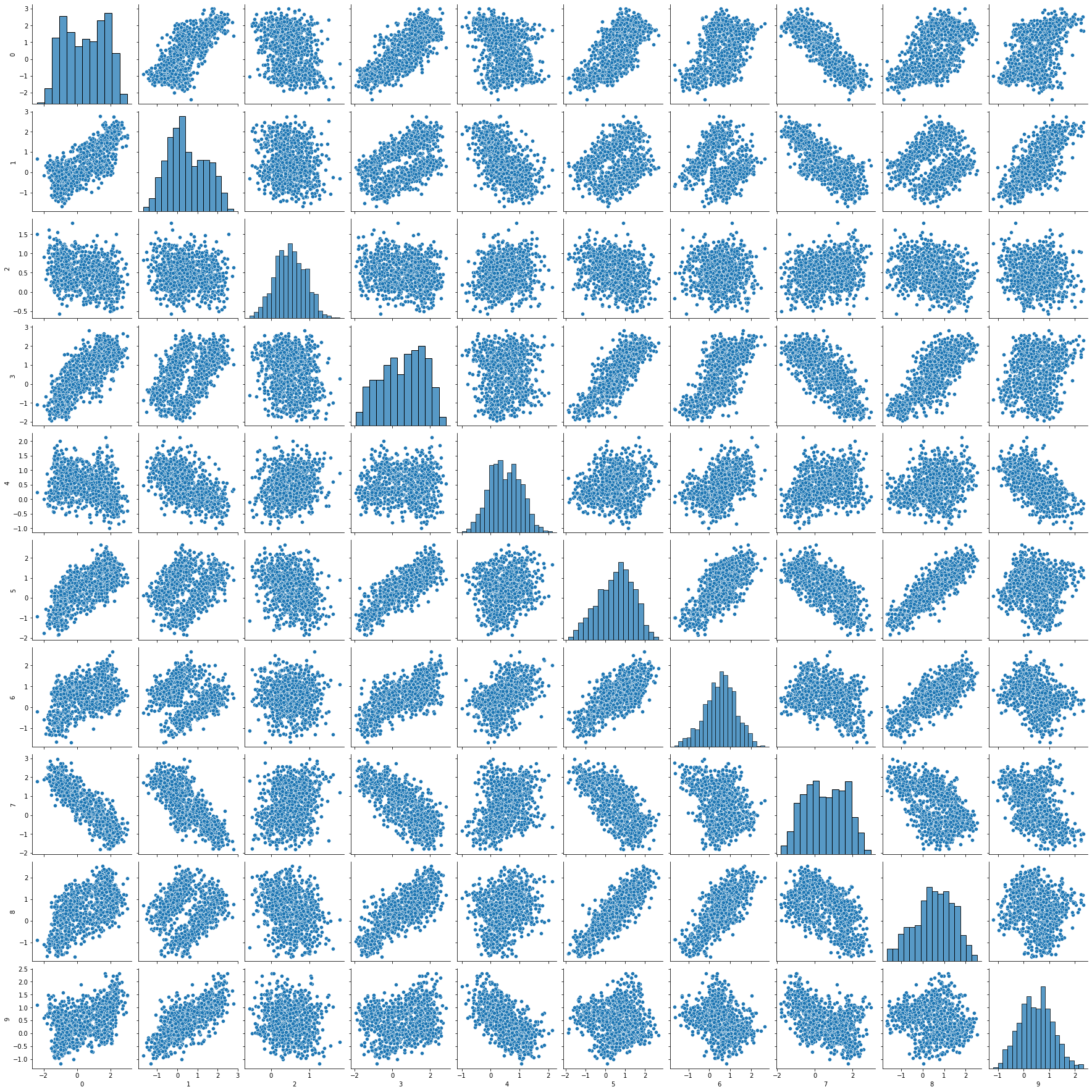
If we look at the generated dataset, different from the first approach, there is nothing immediatly obvious going on that reveals the easter egg, which is a positive thing — the challenge vs. fun trade-off! Also, we can see some correlations between the generated columns, which might trick the user into thinking this data is real and that there are some natural relationships between the features. Now, let’s see what the results of the PCA look like:
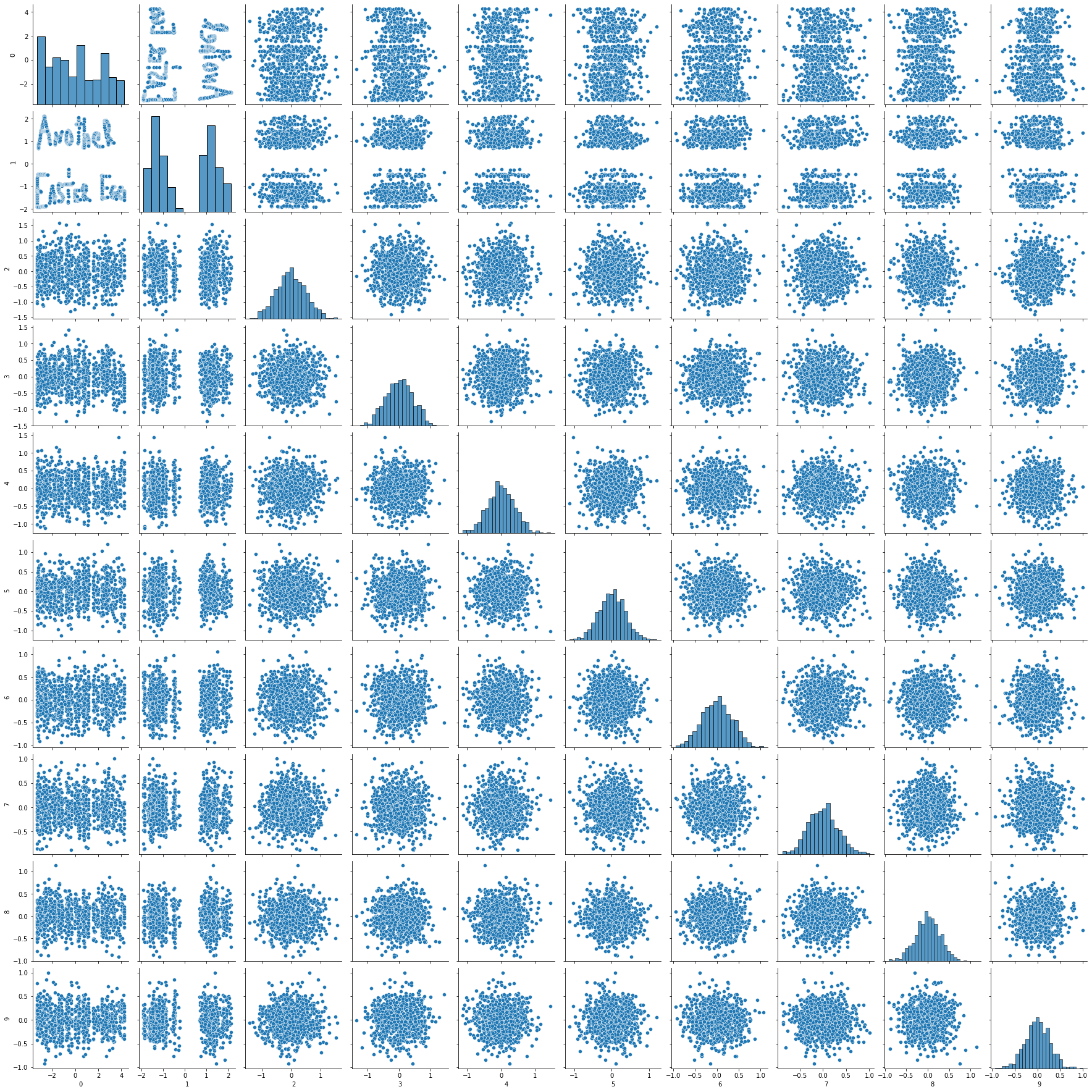
There it is! The scatter plot between the first and second principal components of our dataset reveals our “Another Easter Egg” message. How cool is that?! We’ve made it. We have a not-so-obvious easter egg hidden inside this dataset.
Testing with real people
Finally, to make sure this does not die in my Jupyter Notebook, I’ve sent this experimental dataset to some of my friends to see if they would be able to find the hidden easter egg. The results? Some of them actually did find the easter egg! Some of them required more hints then others though, but that’s fine.
The one thing that would make it even better would be to rescale the features so they looked like continuous features from the real world like age, height, avg. time spent per bus trip or total number of donuts eaten in the past 2 months. Doing this I’d be able to tell a story about the data where I could hide some hints about how to find the easter egg or what the easter egg actually looks like. Maybe in the future, with more time in hands, I can play with different kinds of transformations, maybe different types of data visualization techniques — for instance, how would you hide an easter egg that would be revealed in a form of a boxplot? — and definitelly different ways to make this data look realistic!
That’s all, folks! Hope you enjoyed. Now go get yourself a toy datasets to play with! ![]()