Let's GO(explore)Amazon!
Back in 2016, me and Diogenes were given the task of extracting insights out of some Green Ocean Amazon (GOAmazon) data sets. The GOAmazon experiment was designed and implemented by a partnership between the United States Department of Energy (DOE), São Paulo Research Foundation (FAPESP) and Amazonas Research Foundation (FAPEAM), in order to better understand how some land-atmosphere processes impacted in the climate and hydrology in the Amazon basin [1] . To do so, researchers collected lots of data about weather (e.g. temperature, relative humidity, wind strenght and direction) and about the atmosphere (e.g. carbon dioxide concentration) throughout 5 research sites in the surroundings of Manaus (Amazon State capital).
Even though we knew absolutely nothing about climate/weather/enviroment data analysis,
we faced the challenge (‘cause, why not?) and started to perform the usual exploratory
data analysis. We decided to choose R for this exploratory work (basically because we both knew it and ‘cause ggplot2 is ![]() ).
All the code can be found in this Jupyter Notebook.
).
All the code can be found in this Jupyter Notebook.
The data
Before start working with new data sets there is always this kind of fear of the unknown. We keep questioning ourselves: “What does the data look like? Is it structured or not? What are the available variables? Will us be able to understand the meaning of those variables?”. Luckily, GOAmazon researchers and engineers made a great job providing us with structured and documented data sets.
The experiment sensors collected data every minute (or so) for two consecutive years (2014 and 2015). For each timestamped record we had the following variables:
- Air temperature
- Atmospheric pressure
- Carbon monoxide concentration
- Water (vapor) concentration
- Dinitrogen oxide concentration
- Rain
- Relative humidity
- Wind direction
- Wind speed
Exploratory Data Analysis
One of the main tools in the exploratory data analysis toolbelt is the data visualization. Visually looking for general trends, outliers and relationships between different variables is an essential task before asking any questions or formulating hypothesis.
- Take a look at your distributions!
After some data aggregations, filtering and reshaping (you know, pre-processing stuff that is essential but generallly omitted) we finally can start visualizing it! The almost always first choice for having a general idea about continuous variables is plotting their distributions.
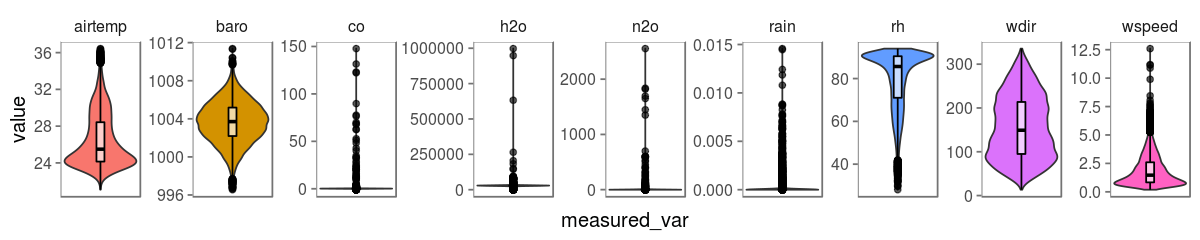
This kind of visualization brings us some useful information. We can now see what are the lower and upper bounds for each variable (this is good, specially if you are not familiar with these variables). We can also verify if the distributions are similar to those most known distributions (does it looks like a Gaussian? Poisson?). Last but not least, we can have a general idea about the existence of outlier records (I’m talking about you CO, H2O, N2O and Rain)
Cool, but what’s next? What we have in hand is time series data, so, the most logic thing to look for now is how do these variables behave across time! Let’s see how it goes.
- How do your variables vary across time?
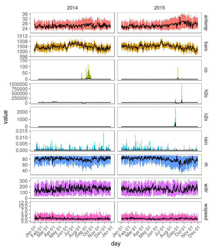
Now let’s get into some interesting stuff we can see here. Gases (CO, H2O and N2O) apparently show some similar patterns: they present standard concentrations during almost the whole year with the exception of some especific periods when the concentrations show a huge increase. What does it mean? Are those sensors sensors broken? Can we trust our data? Is this how it ends?

How do we know if this is a problem in the data collection procedure (broken/uncalibrated sensor) or signal from a real phenomena? Should we just remove those values before performing the next analysis? Let’s just leave it there for now while we take a look at the other variables.
- The good ol’ correlations
Another good friend of yours are the scatter plots and correlation matrices. They can help you have a general notion of positive/negative relationships between your variables (not saying causality here, folks). I’m not going to show the whole correlation matrix here (you can find it here). Most of the pairwise absolute correlations are not strong, with the exception of the correlation between the air temperature and relative humidity, which is a strong negative correlation (Pearson -0.961). If we aggregate those variables by hour and plot it, this is what we see:
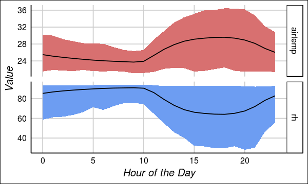
For those who are not familiar with this scientific domain (like us), this instantly looks
appealing but, actually, this is just well-known obvious stuff.
In simple words, when the air temperature increases, the air can hold more water,
so the relative humidity decreases. Even though this does not looks super nice anymore, it
shows us that at least the air temperature relative humidity sensors were well and functioning.
Now, let’s get back to our potential outliers. ![]()
- Oh, the outliers
There is a quote from a famous philosopher that goes something link this:
Outliers. To remove or not to remove? - Bob Marley, 2014
This is a question that always arises. In bioinformatics, experimental outliers caused by, for instance, sample contamination, different protocols or even uncalibrated devices, can completely affect your results. Thus, in general, we exclude them because they can cause more harm then if we leave it there - unless its some hard-to-get data, which, in this case, we think twice before removing it.
We decided to take a deeper look into our current outliers, to see if we can find some patterns in it. We selected the the carbon monoxide (CO) variable as our first candidate. In order to find some year trend in the outlier appearance, we grouped the data by year and month and plotted it. Here is the result:
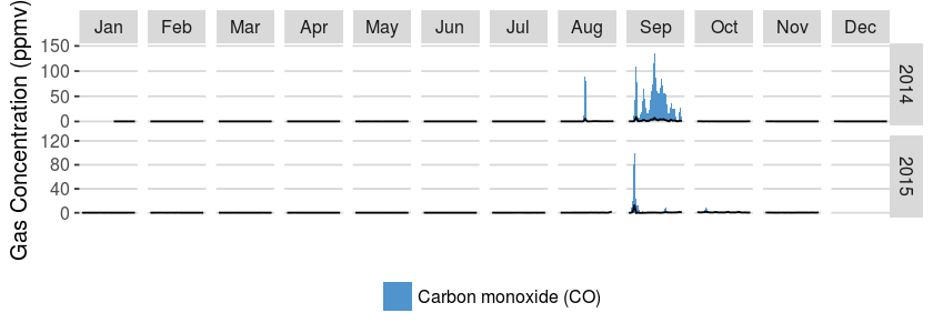
Interesting, right?! Apparently the potential outliers only occur between August and October of both years. This visualization led us to think that those outlier observations were problably not being caused by sensor failures. What the heck is causing those discrepant observations? Time to create some hypothesis, friends!
- Hypothesis time!
If you have a good memory, you remember that all this data was collected in the surroundings of Manaus, specifically in a small city, Manacapuru, located southwestern to Manaus. In the following figure you can see Manacapuru right in the center of the map.
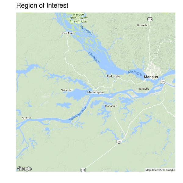
Manaus has a free-trade zone with different kinds of national and transnational industries. With that information in mind, out first hypothesis was: extreme values of CO in Manacapuru are probably a consequence of CO release from industries located in Manaus. This, however, doesn’t explain why the extreme values only show up between August and October. So we thought that this might be related with some seasonal changes in the wind direction and speed. Maybe, in this specific months, the wind was dragging CO from Manaus to Manacapuru.
To evaluate this, we decided to take a look at the wind directions across the months.
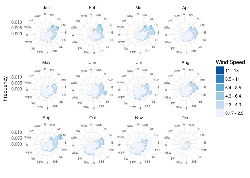
Considering the geographical position of Manacapuru and Manaus, in order to corroborate our hypothesis,
we would expect to see more wind heading to West and South in August, September and October. According to the
windrose plots, there’s no evidence of significant changes in the wind direction during this period. ![]()
If there is no evidence of the influence of the wind direction in our CO measures, what else could be responsible for that? What about talking with someone who might know more about this scientific domain than me?
- Domain knowledge
I decided to talk with an environmental engineer - who is also, by coincidence, my sister. We started discussing what kinds of processes could increase the concentration of carbon monoxide in the air. Considering that CO is the result of incomplete combustion, we thought that would be nice to see if there is any evidence of fire in the region, which might explain those patterns.
Alright, now I need fire data from that specific region. Where would I find it? For my surprise, it was easier than expected. There exists a system called Fire Information for Resource Management System (FIRMS-NASA) that allows you to download Near Real-Time (NRT) fire data collected daily by NASA satellites.
I requested all the fire event data between for 2014 and 2015. For each fire event we had data
about its location (lat and lon), the day it was collected, the confidence of the signal and some
other variables. After filtering the data by confidence, we plotted all the events for both
2014 and 2015 in the map, to see if there is any overlap with our region. This is what I’ve got:
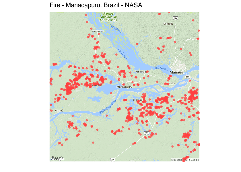
Wow! Each point here represents a fire event registered by the satellite, and there is A LOT of points. But still, this does not mean anything to our hypothesis. If these events are uniformly distributed across the months, this means that this data does not support our hypothesis. Thus, we decided to group those events by month a plot it to the map to see what happens.
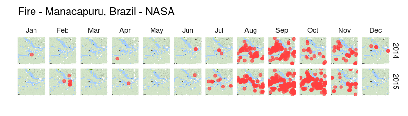
OH YEAH! Apparently, for some reason, there is a high concentration of fire events between August and October, both in 2014 and 2015. Although these fire events are far from being random, we can’t establish a causal relationship between them and the increase in carbon monoxide (we would need some crazy experiment for that). After some more discussion with my sister, we ended with two new hypothesis to explain what we were seeing.
- Antropogenic process: farmers using fire as a “cleaning” method to prepare their fields for the next crop (which is a terrible thing to do, but still pretty common).
- Natural process: this period of the year is the drought season in that region, which may favour the occurence of natural fire. According to some authors [2], 2015 was the most extreme of the 21st century, with respect to droughts.
Both hypothesis might be right (or wrong). There is a bunch of great scientists working on understanding and describing these processes and how they impact on things such as the global warming . If your interested on these topics, check out [2-4]
Conclusions
This whole work was a great experience. I’ve learned a lot about a scientific domain that I’d never worked with before. It also was important because it showed us that we cannot (and you also shoundn’t) underestimate the power of data visualization and, more importantly, domain knowledge. As a data scientist your job is to understand the data you are dealing with. If you are not familiar with this domain, sit down, grab a cup of coffee and read some review about it. It will a lot easier to create cool hypothesis about the things your seeing in your data.
References
- Green Ocean Amazon: https://campaign.arm.gov/goamazon2014/
- Jimenez-Muñoz, J. C. et al. Record-breaking warming and extreme drought in the Amazon rainforest during the course of El Niño 2015–2016
- Aragão, L. E. O. C. et al. 21st Century drought-related fires counteract the decline of Amazon deforestation carbon emissions
- Malhi, Y. et al. Climate Change, Deforestation, and the Fate of the Amazon